

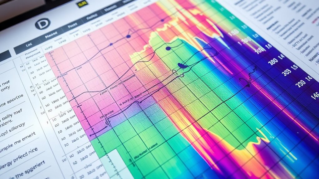
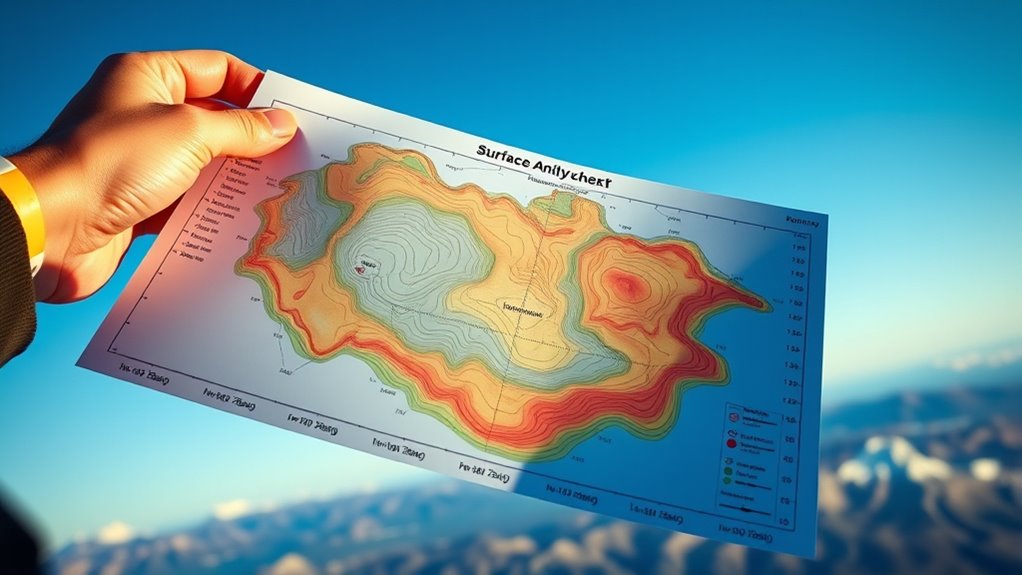
To decode a surface analysis chart for soaring, start by identifying symbols for fronts, pressure systems, and cloud cover, which show weather boundaries and lift zones. Follow wind arrows to see flow patterns and pressure differences, helping you find areas with good lift potential. Pay attention to temperature and dew point lines to assess humidity and cloud formation. Mastering these elements boosts your ability to select ideal flight routes—continue to explore for detailed tips.
Key Takeaways
- Identify high and low-pressure systems using pressure lines to predict lift and sink zones.
- Recognize front symbols (triangles and semicircles) to assess boundary zones affecting soaring conditions.
- Analyze wind arrows and isobar spacing to determine wind strength, direction, and potential thermal activity.
- Observe cloud cover patterns, humidity markers, and precipitation to evaluate atmospheric stability and lift sources.
- Use temperature and dew point data to identify moisture levels and forecast thermal development for flight planning.

Fulmoon 9 Pcs Weather Posters Set Human Shaped Weather Table Chart Weather Bulletin Board Division Chart Artificial Weather Chart for Preschool Kindergarten Leaning Studying Classroom Wall Decor
Human Shaped Design: our weather posters designed with cute human shaped characters, vivid and interesting, 9 different colors…
As an affiliate, we earn on qualifying purchases.
As an affiliate, we earn on qualifying purchases.
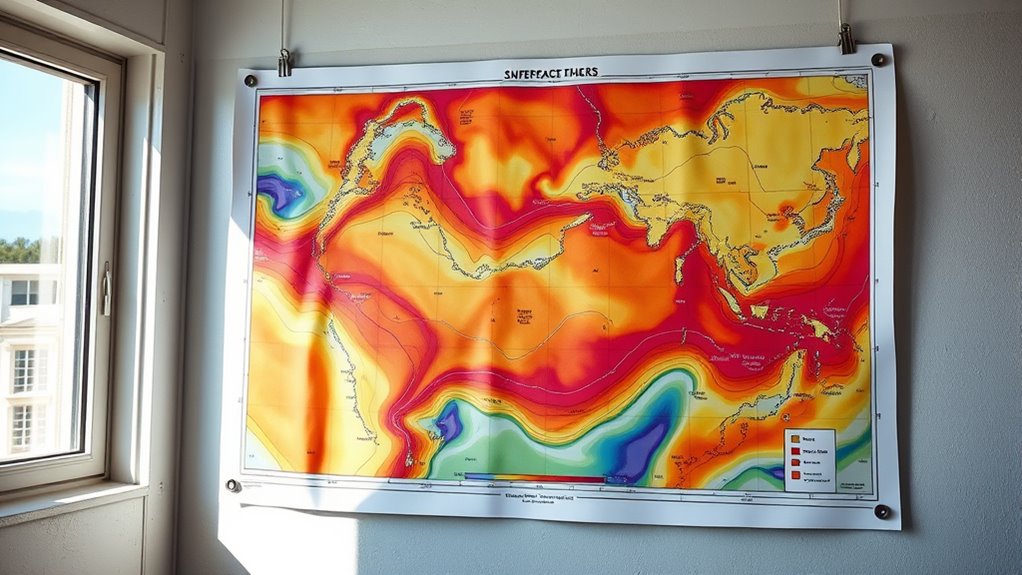
Understanding the Purpose of the Surface Analysis Chart
Understanding the purpose of the surface analysis chart is essential for interpreting its data accurately. This chart helps you visualize current weather conditions across regions, which is crucial for weather pattern predictions. By analyzing features like high and low-pressure systems, you can anticipate changes in weather that affect flying conditions. It also offers insights into climate change impacts, showing shifts in weather patterns over time. Recognizing these patterns allows you to prepare for storms, cold fronts, or heatwaves that may influence your soaring plans. Essentially, the surface analysis chart provides a snapshot of atmospheric conditions, serving as a vital tool for pilots, meteorologists, and enthusiasts alike. Weather patterns and their shifts are also influenced by global climate dynamics, making this chart an important resource for understanding long-term trends. Grasping its purpose enhances your ability to make informed decisions based on real-time weather data.

Advanced Pilot Products Rotating Aviation Plotter – Precise Navigation Tool for Student Pilots – Ideal for FAA Exam & Flight Training – Durable, Lightweight – Fast Course Plotting & Wind Correction
Enhance Course Accuracy: The rotating aviation plotter from Advanced Pilot Products elevates your navigation experience by allowing precise…
As an affiliate, we earn on qualifying purchases.
As an affiliate, we earn on qualifying purchases.
Key Symbols and Their Meanings
Ever wondered what the symbols on a surface analysis chart mean? These symbols represent key weather features that affect soaring conditions. For example, cloud cover is often shown with different shading or patterns, indicating clear skies, scattered clouds, or overcast conditions. Humidity levels are reflected in symbols like dew point lines or specific markers, helping you gauge moisture in the air. Solid lines may show pressure systems, while symbols such as triangles or semicircles depict cold or warm fronts. Recognizing these symbols allows you to quickly assess the weather environment, determine potential lift sources, and plan your flight accordingly. Mastering the key symbols ensures you interpret the chart efficiently and make informed decisions for safe, successful soaring. Additionally, understanding weather patterns can greatly enhance your ability to anticipate changes in conditions and optimize your soaring experience.
thermal lift prediction tools
As an affiliate, we earn on qualifying purchases.
As an affiliate, we earn on qualifying purchases.
Interpreting Wind Patterns and Directions

Have you ever wondered how to read wind patterns on a surface analysis chart? You can interpret wind directions by studying the arrows and their orientation. These arrows indicate the flow of air, which is driven by the pressure gradient—the difference in pressure between high and low-pressure areas. Strong pressure gradients create faster winds, while weaker ones produce gentler breezes. Pay attention to areas where air masses interact; these zones often show tighter spacing between isobars, signaling stronger winds. As air moves from high to low pressure, it follows a specific pattern influenced by the Coriolis effect, causing winds to curve. Understanding the Gold IRA market can also help you anticipate economic shifts that might influence investment decisions, much like reading wind patterns aids in predicting soaring conditions and identifying ideal lift zones effectively.

Weather Signs Stickers |50Pcs Weather Symbols Waterproof Vinyl Decals for Bike Water Bottles Laptop Bicycle Refrigerator Cup Luggage Computer Mobile Phone Skateboard Décor
◊【 Wide Applications】 — These Weather Notation Stickers can be attached to laptop, suitcase, computer, skateboard, refrigerator, wardrobe,…
As an affiliate, we earn on qualifying purchases.
As an affiliate, we earn on qualifying purchases.
Analyzing Temperature and Dew Point Data
Understanding temperature trends helps you track how weather conditions change over time. Dew point data reveals moisture levels that can signal upcoming instability or storms. Recognizing these patterns allows you to forecast potential weather shifts more accurately. Monitoring personal empowerment strategies can further enhance your ability to adapt to changing conditions.
Interpreting Temperature Trends
How can you effectively interpret temperature trends on a surface analysis chart? Focus on identifying patterns of temperature fluctuations across regions. Consistent increases suggest warming air, while drops indicate cooling trends. Pay attention to areas with rapid temperature changes, as they reveal shifts in heat distribution. These variations help you determine where warm or cold air masses are moving, which impacts soaring conditions. Understanding the temperature trend lines and their slopes allows you to gauge whether the atmosphere is stabilizing or destabilizing. Recognizing these shifts helps you anticipate thermal activity and plan your flight path accordingly. Accurate interpretation of temperature data is essential for maximizing soaring performance and ensuring safety. Additionally, monitoring automation technologies applied in weather forecasting can improve the accuracy of temperature trend predictions, further aiding in your decision-making. By observing how temperature values evolve over time and space, you gain critical insights into the atmospheric environment.
Dew Point Significance
Why does the dew point matter when analyzing surface data? The dew point indicates the humidity levels in the atmosphere, revealing how close the air is to saturation. A higher dew point means more moisture, which can lead to cloud formation and potential soaring opportunities. When the dew point is close to the air temperature, it suggests the air is humid and that clouds are more likely to develop. This information helps you assess the stability of the atmosphere and predict weather patterns affecting soaring conditions. By understanding dew point data, you can better interpret how moist or dry the air is, enabling more accurate decisions about when and where to fly. Additionally, surface analysis charts can help visualize these humidity and temperature relationships more clearly. In short, dew point provides essential clues about humidity levels and cloud formation potential.
Identifying Instability Patterns
Analyzing temperature and dew point data together allows you to identify patterns of atmospheric instability. When these readings are close, it indicates high humidity and increased thermal activity, which can lead to rising air currents. Sudden drops in temperature or dew point suggest cooling aloft, signaling potential for cloud cover development. Look for areas where the temperature gradient is steep; this often correlates with unstable air and vertical motion. Visible cloud cover, especially cumuliform clouds, further confirms instability. By recognizing these patterns, you can anticipate turbulent conditions and soaring opportunities. Monitoring the thermal activity and cloud cover in conjunction with temperature and dew point data helps you decode the atmosphere’s behavior, giving you a clearer picture of when and where instability might enhance or hinder your flight.
Recognizing Fronts and Weather Boundaries
Recognizing fronts and weather boundaries on a surface analysis chart is essential for understanding atmospheric changes. These boundaries indicate shifts in temperature, humidity, and wind patterns, affecting soaring conditions. Look for symbols like triangles (cold fronts) or semicircles (warm fronts), which mark these junctures. Mountain obscuration can hide frontal features, so be cautious when the terrain masks key indicators. The jet stream often aligns with frontal boundaries, guiding weather systems and influencing lift zones.
Recognizing frontal boundaries on surface charts helps anticipate weather shifts and soaring conditions.
You should focus on:
- Identifying sharp temperature gradients that signal fronts
- Noticing wind shifts and barometric pressure changes
- Observing how mountain obscuration impacts the visibility of weather features
Mastering these signs helps you anticipate weather boundary movements and optimize your soaring strategy.
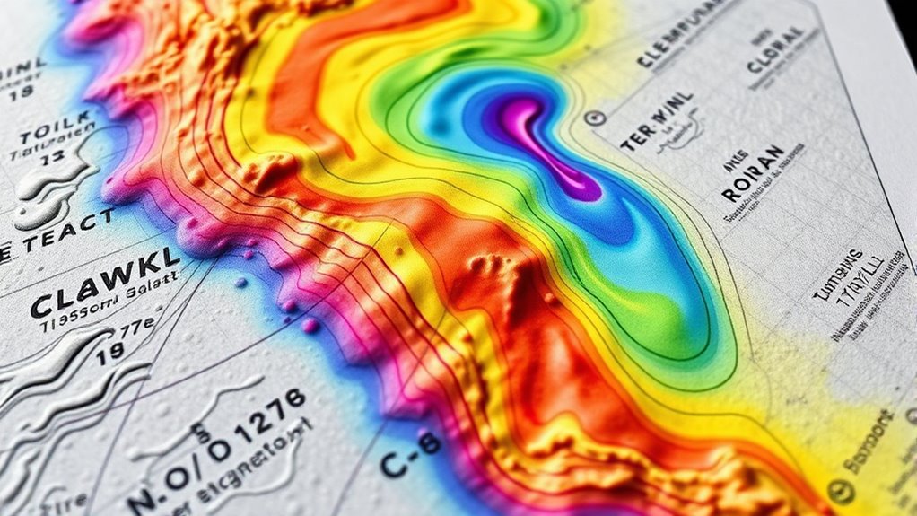
Identifying Areas of Convergence and Divergence

Identifying areas of convergence and divergence is essential for understanding where rising or sinking air is likely to occur, which directly affects soaring conditions. Convergence zones occur when air flows meet, causing upward motion, while divergence areas result from air spreading apart, leading to sinking. Recognizing these features on the surface analysis chart helps you predict lift or sink zones. Use the following table to identify key signs:
| Feature | Description | Effect on Soaring |
|---|---|---|
| Convergence Zone | Air flows together, rising motion | Promotes lift, good for soaring |
| Divergence Area | Air spreads apart, sinking motion | Causes sinking, poor lift |
| Wind Shift | Change in wind direction near fronts | Indicates potential convergence or divergence zones |
A surface analysis chart provides valuable information about these features, aiding pilots in making informed decisions during flight planning.
Assessing Weather Conditions for Soaring Opportunities
Have you ever wondered how to determine the best times and places for soaring? Assessing weather conditions is key. Look for areas with moderate cloud cover—too much can hinder lift, while clear skies may lack sufficient thermal activity. Pay close attention to precipitation patterns, as recent or ongoing rain can disrupt soaring conditions or signal unstable air. Monitoring cloud cover trends can also help you predict thermal development and identify optimal soaring windows. Understanding these factors helps you identify the best conditions. By analyzing cloud cover and precipitation patterns on the surface analysis chart, you can better anticipate when and where lift will be strongest, enhancing your flight planning.
Applying Chart Insights to Flight Planning

You can use chart insights to choose the best launch sites for your flight, ensuring favorable conditions. By interpreting key indicators, you’ll better anticipate weather patterns and plan accordingly. Remember to adjust your plans based on weather variability to maximize safety and performance.
Interpreting Key Indicators
Understanding key indicators on the surface analysis chart is essential for effective flight planning, as these metrics directly influence safety and efficiency decisions. When examining cloud cover, note areas with extensive clouds, which can hinder lift and visibility. Humidity levels help identify moisture-rich zones that may produce thermals or turbulence. Additionally, awareness of patterns such as hypersensitivity to criticism can provide insights into potential reaction zones that may impact flight safety. Be mindful of: – cloud cover, as it affects thermal activity and visibility. – Humidity levels, indicating potential thermal strength or instability. – Wind patterns, influencing glide paths and launch points.
Identifying Optimal Launch Sites
How can you pinpoint the best launch sites using surface analysis charts? Focus on areas showing strong thermal uplift and ridge lift. Look for warm surface temperatures and clear sky conditions that promote thermal formation. Also, identify ridges with steady wind flow that can generate lift, extending your soaring time. Use this table to guide your decision:
| Site | Lift Type | Key Indicator |
|---|---|---|
| A | Thermal uplift | Warm surface, clear skies |
| B | Ridge lift | Steady wind along ridges |
| C | Mixed lift | Combination of both |
| D | Low lift | Cool surface, wind shadows |
| E | Prime site | Strong thermal & ridge lift |
Choosing sites with balanced thermal uplift and ridge lift maximizes your soaring potential and flight efficiency. Understanding surface conditions can help you make more accurate site assessments.
Adjusting for Weather Variability
Weather conditions can change rapidly, affecting the reliability of surface analysis indicators like thermal uplift and ridge flow. To adapt your flight plans, always consider current cloud cover and updated precipitation forecasts. These factors can signal shifts in lift availability and safety margins, even if the surface analysis looks promising. Stay flexible by:
- Monitoring real-time weather updates before and during your flight
- Recognizing that increased cloud cover may reduce thermal activity
- Adjusting your route or altitude based on precipitation forecasts that could weaken lift or cause turbulence
Frequently Asked Questions
How Often Are Surface Analysis Charts Updated During Soaring Conditions?
You should check surface analysis charts frequently during soaring because weather patterns can change rapidly, impacting your flight safety. These charts are typically updated every three to six hours, depending on the region and weather conditions. Staying current helps you adjust your flight plan accordingly, ensuring you avoid adverse weather and make informed decisions for safe and efficient flight planning. Regular updates keep you ahead of evolving conditions.
Can Surface Analysis Charts Predict Thermal Activity for Soaring?
Thermal prediction can be somewhat inferred from surface analysis charts, but they mainly show surface variability rather than precise thermal activity. You can identify areas of high pressure or low pressure which often correlate with rising or sinking air, but they don’t directly predict thermal activity. To improve your soaring, combine surface analysis with weather forecasts and real-time observations for better insights into potential thermal zones.
What Are Common Mistakes When Interpreting Surface Pattern Changes?
Think of surface pattern changes like a changing landscape—you might see rolling hills or steep cliffs. When interpreting these, avoid misreading contours that can distort your understanding, like mistaking a gentle slope for a sharp rise. Also, neglecting the scale can cause you to overestimate or underestimate thermal activity. Keep a steady eye, double-check contours, and respect the scale to navigate soaring skies confidently.
How Do Surface Boundaries Impact Lift Availability?
Surface boundaries, like cold fronts or dry lines, create boundary effects that considerably impact lift availability. These boundaries often mark changeover zones where air masses interact, generating lift zones that gliders can exploit. Understanding how boundaries influence local airflow helps you identify ideal lift zones, making your soaring experience more efficient. Pay attention to boundary effects on the surface analysis chart to locate promising lift zones for better performance.
Are There Digital Tools That Enhance Surface Analysis Chart Interpretation?
Imagine holding a lighthouse’s beam in your hand, guiding your soaring journey. Digital interpretation tools act like that beacon, illuminating complex surface analysis charts. They enhance your understanding by offering interactive features and real-time updates. With chart annotation capabilities, you can highlight key features, track patterns, and make swift decisions. These tools transform raw data into a vivid map of lift opportunities, empowering you to navigate the skies with confidence and clarity.
Conclusion
By mastering the surface analysis chart, you can predict soaring conditions with confidence. For example, spotting a low-pressure system with converging winds might signal strong lift, helping you plan your flight route effectively. With practice, you’ll quickly identify key features like fronts and wind shifts, turning complex data into actionable insights. This skill enhances safety and success in your soaring adventures, making every flight more informed and enjoyable.